Table of Content
1. Lecture
2. Instructions
3. Process Work
4. Feedback
5. Reflection
LECTURES
Week 01:
It was a public holiday, so no class.
Week 02:
This week is our first lecture class, as Week 1 was a public
holiday. Dr Yip briefed us on the assessment tasks for each module
this semester. We were asked to watch the lecture video and
understand the theory before starting Task 1.
Introduction: Elements & Principles of Design
Elements of Design
1. Point
-
The simplest element of design, a point used as a repetitive mark
forms a line.
2. Line
-
Can be active or static, aggressive or passive, sensual or
mechanical.
-
Can show directions, define boundaries of shapes and spaces, imply
volumes/solid masses, and suggest motion/emotion.
-
Can be grouped to describe qualities of light and shadow and form
patterns and textures.
3. Shape
-
Refers to the expanse within the outline of a
two-dimensional area or within the three-dimensional object.
- Visible when a line or lines enclose an area.
-
Two general categories of shapes:
Geometric & Organic.
-
Geometric: circles, squares, triangles (tend to be precise and
regular).
-
Organic: often curving or rounded (irregular seem more relaxed
& informal than geometric shapes).
4. Form
-
Two-dimensional area is referred to as a shape. A
three-dimensional area is called a form.
-
When a form encloses space, the space is called
volume.
5. Texture
-
Refers to the tactile qualities of a surface or to the
visual representation of those qualities.
-
Two categories of texture: Actual (experienced by touch)
& Simulated/Implied (created to look like the real
texture).
6. Space
- Indefinable, general receptacle of all things.
-
Three-dimensional space is experienced when we are in it. From
the outside, we experience mass. From the
inside, we experience volume.
-
In graphic design, space or depth refers to the area that a
shape or a form occupies.
-
Space can be defined as positive (filled space) or
negative (empty space).
7. Color
- Visual byproduct of the spectrum of light.
- Hue: Colors of the spectrum (e.g. yellow and green).
-
Value: Lightness or darkness from white through
greys to black.
-
Intensity: Called saturation or chroma, it refers to
the purity of a hue.
-
Color schemes help
create mood, focus, and harmony
in design.
-
Monochromatic: Variations in the value and intensity of a
single hue (e.g. shades and tones).
-
Analogous: Variations in the value and intensity of a
single hue (e.g. blue and green).
-
Complementary: Emphasize two directly opposite hues (e.g.
blue and orange).
Principles of Design
➹ Topic 1: Contrast & Gestalt Theory
1.1 Contrast
-
The juxtaposition (differences) of strongly dissimilar elements.
-
Without contrast, visual experience would be monotonous
(boring).
-
It provides visual interest, emphasize a point and express
content.
Figure 1 Types of Contrast
1.2 Gestalt Theory
- "Gestalt" refers to "shape" or "form" in German.
-
Human brain is wired to see patterns, logic, structure. Gestalt
principles or laws are rules that describe
how human eye perceives visual elements. It aims to show
how complex scenes can be reduced to more
simple shapes and explain how the eyes perceive the
shapes as a single united form rather than separate
simpler elements involved.
Key Principles in Gestalt Theory:
Figure 1.1 Gestalt Principles
1. Principle of Similarity
-
We tend to perceive similar elements that share visual
attributes such as shape, picture, or group, even if those
elements are separated. Our brain seems to create a link between elements or a similar nature.
2. Principle of Continuation
-
Using paths, lines, and curves in a design directs the eye to
follow the continuous flow of elements. This principle
creates a smooth, continuous flow.
3. Principle of Closure
-
We tend to see complete shapes even when visual elements
are incomplete or disconnected. Human eye can perceive a
complete shape by filling in the missing or blank visual
information.
4. Principle of Proximity
-
Ensure that related design elements are placed
together. Any unrelated items should not be together.
-
Close proximity shows that items are connected or related to
each other and become one visual unit or category which helps
to organize or give structure to a layout.
5. Principle of Figure/Ground
-
Objects can be perceived as being either in the
foreground or the background.
-
They either stand out prominently in the front (the figure) or
recede into the back (the ground).
Figure 1.2 Principle of Figure/Ground
6. Principle of Symmetry & Order
-
Elements that are symmetrical to each other tend to
be perceived as a unified (consistent) group.
-
Objects that are symmetrical are likely to be grouped
together, similar to the law of similarity.
Figure 1.3 Types of Symmetry
➹ Topic 2: Balance & Emphasis
2.1 Balance
-
In design, balance refers to the
distribution of visual weight. Visual equilibrium causes the overall image to appear balanced.
-
There are 2 types of balance:
Symmetrical & Asymmetrical.
Types of Balance:
1. Symmetrical Balance
-
Equal "weight" on equal sides of a
centrally placed fulcrum (the support).
-
The equal arrangement either on side of the
central axis (horizontal or vertical) resulting in
bilateral balance.
-
Radial balance: elements arranged equally around
a central point.
-
Approximate symmetry: equivalent but not identical
forms
are arranged around the fulcrum point.
2. Asymmetrical Balance
-
Unequal visual weight on each side of the
composition.
-
One side of the composition might contain a dominant
element/more power, which could be balanced by a couple
or more lesser focal points on the other side.
-
More dynamic and interesting. Creates feelings of
modernism, movement, energy and vitality.
-
Unlike symmetrical balance, asymmetrical balance
provides greater visual variety. It is
more complex (complicated) because of
the relationships between elements, and it can be
difficult to achieve.
Figure 2 Types of Balance
2.2 The Golden Ratio
-
Also known as phi, the Golden Ratio (other names:
Golden Mean, Golden Section).
-
The Golden Ration is a mathematical concept that has
been used over the centuries, as a
symbol of perfect beauty and is uniquely found
throughout nature.
-
It has been used as a
guide to create visual balance in architecture
and paintings.
-
It can be used to bring
harmony, balance and structure to a design.
Figure 2.1 The Golden Ratio
2.3 Rule of Thirds
-
A composition guideline to create more
dynamism (movement).
Figure 2.2 Rule of Thirds
2.4 Emphasis & Dominance
-
Used to create dominance and focus on a
design work.
-
Various elements such as color, shapes or
value can be used to create emphasis and
achieve dominance.
Figure 2.3 Example of Emphasis & Dominance
Week 03:
➹ Topic 3: Repetition &
Movement
3.1 Repetition (Pattern and Rhythm)
-
It makes a work
seem active and "alive," helping to
create rhythm and pattern within
the composition.
-
Variety: Keep rhythms exciting and
active, and to
avoid monotony (boring). Pattern
enhances visual excitement by enriching surface
interest.
3.2 Movement
-
It's the path the eye follows. The way a
design leads our eye
in, around, and through a
composition.
-
It creates
a sense of movement, making the visual image appear to be in
motion to the viewer.
-
Types of movement in a visual image:
Shapes, forms, lines, and curves.
Figure 3 & Figure 3.1 Movement in Graphic
Design
3.3 Hierarchy
-
Choreography of content in a composition to communicate information and convey
meaning.
-
It highlights the main point that the designer
wants the viewer to notice.
-
Visual hierarchy directs viewers to
the most important information first.
Figure 3.2 Example of Hierarchy in Design
3.4 Alignment
-
The placement of elements in a way that
edges line up along common rows or
columns, or their bodies along a
common center.
-
It creates
a sense of unity and cohesion,
contributing to the aesthetic and
perceived stability to the overall
design.
-
It helps lead a person through a design.
Figure 3.3 Example of Alignment
➹ Topic 4: Harmony & Unity
4.1 Harmony
-
The selection of elements that share a
common trait (e.g. same theme, aesthetic
style or mood).
-
Harmony becomes monotony without
variety (a change or slight
difference in elements and objects).
Figure 4 Harmony in Design
4.2 Unity
-
Refers to the
repetition of particular elements such as colors, shapes or materials (to
pull the look together).
-
When elements are composed in a balanced
way, they create
a sense of oneness and creates a consistent theme.
-
Unity and harmony each play distinct roles
in design, even though they may sound
similar.
Figure 4.1 Unity in Graphic Design
4.3 Scale & Proportion
-
Scale and proportion are both design
elements that have to do with size.
-
Scale: Size of one object in relation to the
other objects in a design/artwork.
-
Scale can be determined in 2 ways:
Actual measurement & Visual estimates based on comparison.
-
Proportion: The relationship of two or more
elements in a composition.
➹ Topic 5: Symbol, Word & Image
5.1 Symbol
-
In design, symbols can provide or convey
information, equivalent to one or more
sentences of text, or even a whole story.
-
There are
Visuals & Graphic Symbols.
-
Graphic symbols consist of Pictorial
symbols, Abstract Symbols and Arbitrary
symbols.
Pictorial Symbols: Image-related and
simplified pictures.
Abstract Symbols: Symbols that look like
the objects that they represent but have
less details.
Arbitrary Symbols: Have
no resemblance (similarity) at all to the objects or the ideas they
represent. Many symbols are based on the meaning
behind them, using geometric shapes and colors.
Figure 5
Types of Symbols
5.2 Word & Image
-
Imagery is a vital part of design. It is
important to use
suitable and relevant images when
designing.
-
Selecting the
right words and the right images
would deepen the meaning of the design.
Suitable typeface and strategic
positioning of the type will result in
visual hierarchy and balance in a work of
design.
-
Typography is the design and arrangement
of text to convey a message or concept.
➹ Topic 6: Visual Analysis
6.1 Visual Analysis
-
A skill that helps people read and
critically interpret images, whether in
a museum, on social media, in
entertainment, advertising, or the news.
-
Helping people seek out answers instead
of passively receiving
information.
-
Visual analysis includes the three
phases below.
Phase 1: Observation
-
Look closely to
visual elements, trying to
describe them carefully and accurately
in our own words.
Phase 2: Analysis
-
Think about your observations and
try to make statement about the work
based on the evidence of your
observations.
-
Talk about the effects on the viewer.
-
Talk about how and why your eyes led
through the work.
Phase 3: Interpretation
-
Summarize the observations, description,
and analysis of the work,
supporting them with facts and
historical context you find in
trustworthy published sources.
-
Identify the meaning and the
purpose of the design.
This week’s lecture is a self-study session! We will continue working on Task 1 and show our progress during the consultation.
INSTRUCTIONS
PROCESS WORK
Exercise: Understanding Design Principles
➼ Instructions: Describe each design principle listed below and
select suitable design examples to demonstrate your
understanding.
➼ Instructions: Explain why you chose that design and write a description of
about 150-200 words.
- Gestalt Theory
- Contrast
- Emphasis
- Balance
- Repetition
- Movement
- Harmony & Unity
- Symbol
- Word & Image
Upload the image of the art/design work in your Task 1 blogspot.
Below the image, include the credit information of the art/design
work (title of art/design work, artist's/designer's name, year,
size, medium of the art/design work and the
source).
1. Gestalt Theory
-
This theory commonly associated with human mind and how we
perceived and create meaning from visual elements. "Gestalt"
means "shape" or "form" in German. The human brain tends to
organize the visual elements it perceives into a complete whole,
even when those elements are separated and not unified or
merged. In last semester's lecture, Illustration and Visual
Narrative, I learned the seven principles of poster design,
which align with Gestalt theory. As a result, I already had some
prior knowledge of this theory. In simple terms, Gestalt theory
relies on the viewer’s imagination, guiding the viewer’s eye
through their own way of thinking.
Principles in Gestalt Theory:
➢ Principle of Similarity: The human eye groups
element
that are alike.
Example:
Figure 6 Principle of Similarity
Figure 6 above, the Gestalt principle of similarity is used.
According to this principle, when elements appear similar to one
another, we naturally will group them together and assume that
they share the same characteristic or function. In the image,
the shapes share similar visual features. Although there are
triangles and circles, which are different shapes, our brain
tends to organize them into groups based on their similarities.
The principle of similarity is not only limited to shapes but
also applies to color, size, and texture. When elements share
common visual characteristics, viewers perceive them as
connected or linked. One advantage of this principle is that it
helps viewers easily recognize and categorize information. It
also makes it easier to absorb and understand visual content. To
sum up, the principle of similarity means that when elements
look similar, we naturally group them together, even if they are
actually different.
➢ Principle of Continuation: The human eye
follows a line from one shape to another.
Example:
Figure 7 Principle of Continuation
Here, in the image above, the Coke bottles form a curved line
in the design, creating a continuous flow of visual elements
rather than separated objects. Our eyes naturally follow the
paths, lines, and curves of the bottles. Looking at the image
feels as if the bottles extend endlessly. The curved lines
guide the viewer's eye smoothly through the design. Using the
principle of continuation enhances a composition because it is
visually attractive and captures the viewer's attention. The
flow of the bottles encourages the viewer to move in one
direction without interruption. In my opinion, the principle
of continuation is applied when we want the viewer to keep
looking or reading through a design. This continuous flow
allows the viewer to follow the path almost unconsciously,
increasing the viewer's curiosity and encouraging exploration!
In short, the principle of continuation creates a sense of
flow and connection among the elements, guiding the viewer
through the design.
➢ Principle of Closure: The human eye
fills in the gaps to complete an image.
Example:
Figure 8 Principle of Closure
The human eye tends to perceive complete shapes by filling in
missing visual information. For example, in the image above
(fig.8), I believe that we can recognize that it is a Dalmatian (a
type of dog). However, the image above does not contain complete
lines that clearly outline a dog. Instead, it is made up of
several black shapes/dots that suggest the form of a dog. Our
minds automatically complete the missing lines to create the image
of a dog. Positive (the dog itself) and negative space (the
background around the dog) combine here together to shape our
perception. This principle is actually based on the idea that our
brains are connected to recognize patterns and fill in gaps in
order to create a complete and meaningful image. The image above
uses a small amount of simple visual information to help us
perceive objects and patterns. However, if there is not enough
information to complete the pattern, our minds may be unable to
recognize the object correctly. For instance, if several black
dots were removed from the image, would we still be able to
complete the shape and recognize it as a dog? HAHA :)
➢ Principle of Proximity: The human eye
connects elements that are near each other.
Example:
Figure 9 Principle of Proximity (Vanita Still Life)
The image shown above uses the Gestalt principle of proximity.
Proximity means how close or far apart things are in design.
When elements are placed near each other, our eyes naturally see
them as connected, as in the same group. Proximity helps create
unity in a composition. The closer the items, the stronger the
sense that they belong together in a group or are linked. On the
other hand, if the elements are far apart, they seem unrelated
and have no connection at all. Figure 9 uses a number of
elements that are in different colors, shapes, sizes, and
textures. However, the elements are in close proximity to each
other and creates a sense of unity in the overall composition.
Their closeness links them together; the elements in the image
are all related to the themes of life, death, and passing time.
In conclusion, using proximity in a design helps viewers see how
elements are related and makes the overall layout more organized
and easier to understand!
➢ Principle of Figure/Ground: The human eye
separates a figure and a background in an image.
Example:
Figure 10 Principle of Figure/Ground
The figure above uses the Gestalt principle of figure/ground.
In the image, our eyes separate the figure from the background
(negative space). At first glance, the black element appears as
an elephant. However, when we observe the white spaces at the
top and bottom of the elephant, two additional elements emerge:
a group of trees above and a whale below. This design uses both
positive and negative space effectively, allowing viewers to
perceive multiple images simultaneously. This playful aspect of
the figure/ground principle demonstrates how objects can be
perceived as either foreground or background depending on visual
interpretation. The principle of figure/ground is interesting
because we can often see more than one element in a single
image. To be honest. At first glance, I couldn't notice the
elephant. However, if you look at it more carefully, you can see
that the black branches actually form the shape of an
elephant.
➢ Principle of Symmetry & Order: The human
eye perceives symmetrical elements as a
whole balanced image.
Example:
Figure 11 Principle of Symmetry & Order
In figure 11, the principles of symmetry and order are shown.
Symmetry and order mean that objects are aligned, balanced,
and arranged with each other. In the image above, the two
women's faces are symmetrical on the left and right, with
equal visual weight on both sides. This creates a balanced
layout and brings consistency to the design. The woman’s body acts as the central point, separating the two faces. Because of this symmetry and
order, viewers can clearly, easily, and quickly perceive
both faces and the central body. The figure uses the balance of shapes and sizes
to create symmetry and order. A balanced composition conveys
a sense of calm and organization, enhancing the overall visual experience. This principle allows humans to instantly understand a design or artwork, just like in the example above. Our minds are prone to
perceive objects as symmetrical and arranged in a specific
order. I chose the image above because it is visually
cohesive and clearly demonstrates the principle of symmetry
and order.
2. Contrast
-
Emphasize a focal point and convey the content effectively. The
main aspects of contrast are the differences that make elements
distinct from one another, allowing them to be easily noticed
and stand out. It is through contrast that visual impact is
emphasized, providing viewers with diverse perceptual
experiences. Strong contrast between the background and element colors is
important because it makes the main point stand out.
Example:
Figure 12 Example of Contrast
Above the image, there is a flamingo on a red background and
a flamingo on a green background. At first glance, we are likely
to notice the flamingo on the right (green background) because of
the strong contrast between red and green. The green background
immediately draws our attention, making the flamingo stand out as
the focal point. This contrast allows us to notice the flamingo on
the right more than the one on the left. The combination of green
and red creates a powerful visual effect, using color contrast to
capture the viewer’s attention. In addition, the left image lacks
contrast because both the background and the flamingo use a
similar color scheme. As a result, the viewer cannot immediately
notice the flamingo and must make a conscious effort to find it.
The overlapping colors of the background and the flamingo cause
the focal point to be lost. In conclusion, contrast is one of the
important elements we need to utilize in a design to create a
stronger and more effective composition in our artwork.
3. Emphasis
-
In design and art, we can create
focus, highlight, or dominance
to guide the viewer’s attention. There are various ways to
convey the main message we want, using elements such as
color, shape, or value. Emphasis helps
direct the viewer to notice what is most important in the
design.
Example:
Figure 13 Example of Emphasis
In the image above, the
yellow umbrella is
emphasized through its
size and color,
creating a clear highlight in the composition. The yellow
umbrella stands out the most, as it is the only one filled
with color compared to the black umbrellas, unintentionally drawing the viewer’s attention. Simply put, the yellow umbrella is the main focus of this
image, while the black and white umbrellas in the background
play a minor role. Emphasis is used in design to draw the
viewer’s attention to a specific element and make it stand out
from the rest. In this case, the strong contrast between the
yellow umbrella and the others creates a clear focal point.
Additionally, contrast and emphasis work closely together. In
fact, they are like best friends. Emphasis establishes a
mental shortcut that allows viewers to quickly understand the
message and makes the design more memorable. In short,
emphasis involves using color, shape, size, or value to create
focus on the main element in a design.
4. Balance
-
Balance refers to how the visual weight in a design is
distributed. Balance causes the total image to appear
balanced. Balance in design is making sure the parts
of a design feel even and stable, so the whole design
looks good.
-
There are 2 types of balance: Symmetrical &
Asymmetrical.
Example:
Figure 14 Symmetrical Balance
Source:
Pinterest ⟢ Ellen Beauregard (March 26th, 2019)
Figure 14 shows symmetrical balance
in the artwork. Symmetrical balance refers to a design in
which both sides are identical or very similar in
arrangement and visual weight. In this artwork, the fish
on the left and right mirror each other, although they are
presented in different colors. This type of balance
creates a sense of stability and harmony, making the
overall composition appear well-organized. Both sides
carry equal visual weight, which reinforces the sense of
order and structure. The balanced arrangement also creates
a feeling of equality, as the two fish are positioned
evenly around a central point. The elements are carefully
aligned toward the center rather than placed randomly. As
a result, the fish appear to be swimming toward the
central point, which also introduces a sense of radial
balance.
Although symmetrical balance is often considered less
dynamic than asymmetrical balance, this artwork still
appears lively and energetic. The curved forms and the
movement of the fish create a dynamic effect, making them
seem as if they are actively swimming in the water.
5. Repetition
-
Repetition
literally means
to repeat again and again. In design, repetition makes a composition livelier
and more active. By repeating elements, it creates
rhythm and patterns. Repetition also helps the design
look consistent, clean, and organized. In my opinion,
repetition can leave a strong impression on the
viewer, making the overall composition tidy and
well-arranged. Of course, using
variety
is important to avoid the design becoming monotonous.
Example:
Figure 15 Example of Repetition in Art
The figure above demonstrates repetition through the
repeated use of a woman's face within the composition.
By using the same image multiple times, the design
creates visual consistency and strengthens the overall
unity. This repetition also establishes rhythm and
pattern, making the artwork more structured and
cohesive. However, in my opinion, the image feels
slightly overwhelming because there are too many
repeated faces, making it unclear where the focal
point is. The spacing between the faces is quite
narrow, which reduces visual clarity. If the faces
were spaced slightly farther apart, it might make the
composition easier to view and less crowded.
Repetition is not limited to color; it can also take
place in shape, line or texture. The main purpose of
repetition is to reinforce the visual message, attract
the viewer's attention, and improve memorability. In
this case, because the woman's face appears multiple
times, I am able to clearly remember what she looks
like even without looking at the image. The image
above would actually be quite suitable as a wall
background, and it would make an interesting visual
feature and convey a strong sense of unity.
6. Movement
-
Movement
in design refers to the way the human eye moves
through a composition—the path the eye follows.
Movement gives the viewer the feeling that the
visual image is moving and shows a sense of flow
in a design or artwork.
-
Types of movement: Shapes, forms, lines, and
curve.
Example:
Figure 16 Example of Movement
I can definitely say that everyone who sees the
image above would probably feel that the circle is
moving in or out. This is what we call
movement. Movement guides the viewer’s eyes throughout
the composition and helps the design feel dynamic
and lively. Using movement in a design is
interesting because it makes the visual image feel
alive and connected to the viewer. I chose this
image because the sense of movement is very
obvious, and it completely draws the viewer in
without realizing it. This is one of the fun
aspects of movement; our eyes naturally follow the
visual path created by lines, making the image
appear as if it were moving. It is almost like a
magical or hypnotic effect that keeps the viewer's
attention focused and creates a feeling of being
"lost" in the image above. The design uses lines
(if I am not wrong) to guide the eye, creating a
strong sense of movement, enhancing the overall
viewing experience, and adding visual rhythm and
flow to the composition.
7. Harmony & Unity
-
Harmony
means peacefulness. In design, it refers to
all the elements in a composition fitting
together and creating a sense of calm. For
example, harmony can be achieved through same
theme, aesthetic style, or mood.
-
However, it’s important to remember that
harmony can become dull without
variety.
-
Unity is when elements in a design come
together to create a sense of "oneness". When
color, shape, and material are all combined in
a design, they come together as one, giving
the work a sense of unity and harmony.
-
Harmony is related to unity but is not
synonymous with it.
✧ Note: Mr. Max said that Harmony & Unity
also combine/archived the principles above, like
Movement, Repetition, Balance, Emphasis,
Contrast,
and
Gestalt theory.
Example:
Figure 17
Harmony & Unity (Aspens in Winter)
The artwork above uses both
harmony
and
unity. Firstly, it shows color harmony. The
artwork includes a group of colors that look
good together. Most of the colors are warm
tones, which give a heart-warming feeling as
they gradually shift from cool purple to warm
yellow. Although the two colors come from
different parts of the color palette and are
complementary (opposite), they are blended
harmoniously. The colors in the artwork work
together as one, and nothing feels abrupt. I
really love the colors used in this artwork;
everything is
just right. The combination of elements in this artwork
fits together perfectly; nothing seems extra.
The artwork is not monotonous because it
contains variety, which is important to add to
harmony and unity. Without variety, a design
can feel dull, and nothing would stand out.
The unity in the image is shown through the
branches, which demonstrate the repetition of
particular elements.
8. Symbol
-
A
symbol
can represent things in our daily life,
such as ideas, objects, or concepts, and
can convey information without using text.
You might not realize that a simple, small
symbol can have many different meanings
behind it. A symbol is a powerful tool for
humans to communicate, see, and
understand. For me, I prefer using symbols
to express ideas rather than using text.
They are more convenient and easier for
people to use in daily life.
✧ Note: A symbol
and a
logo
are related, but they are
not the same thing.
Example:
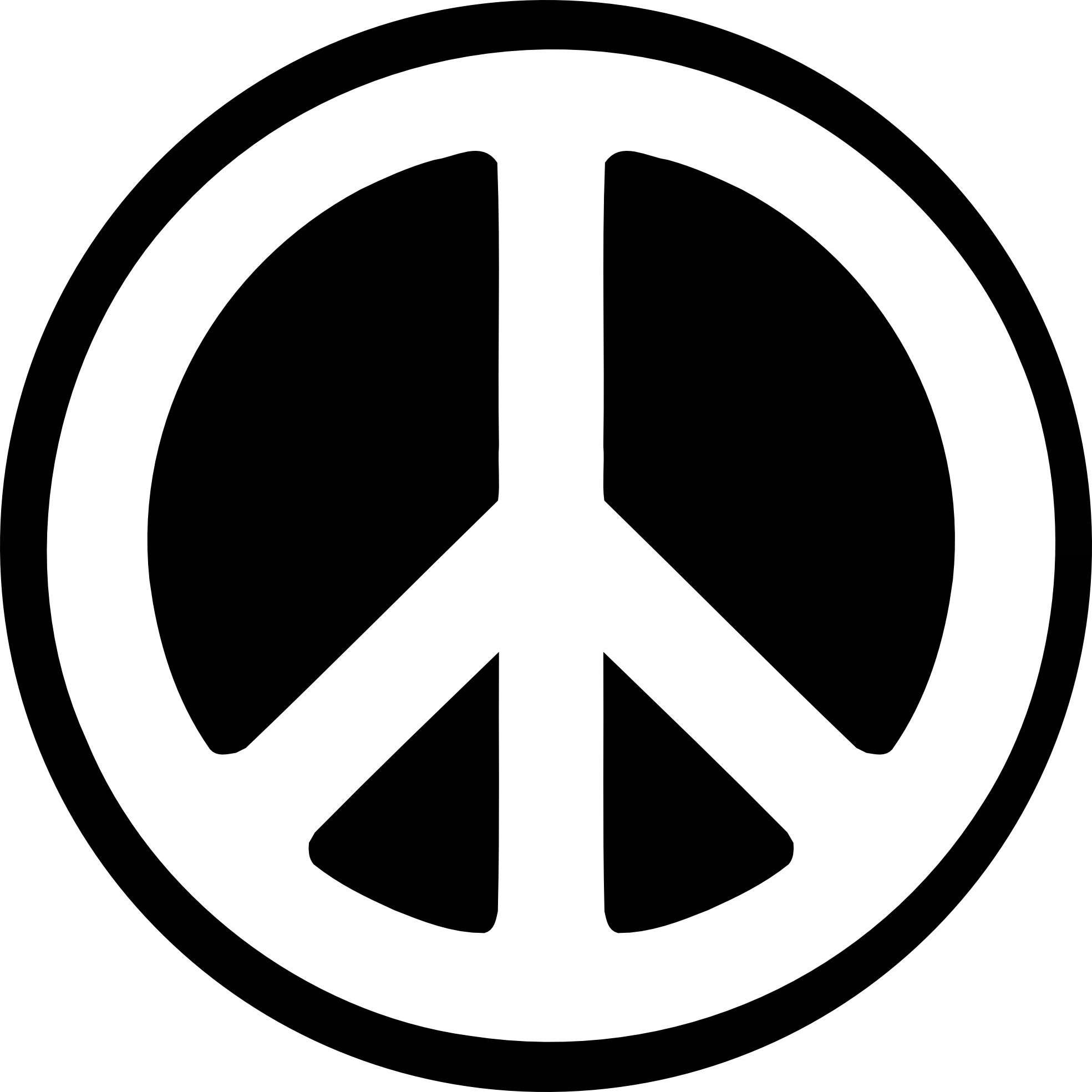
Figure 18 Peace Symbol (Abstract Symbol)
The peace symbol is an example of an
abstract symbol. It is a famous symbol that represents
peace, love, and freedom. Abstract symbols can look somewhat like
the objects they represent but have fewer
details and no obvious connection to their
meaning. The peace symbol, for example,
may resemble a tree or a car tire, but it
does not represent those things; it has a
deeper meaning behind it. A simple symbol
like this can carry a powerful message and
is easy for people to recognize. In short,
an abstract symbol is not as direct as a
pictorial symbol. A pictorial symbol is
directly related to the image it
represents, while an abstract symbol
contains fewer details and is less
straightforward. The peace symbol is a
simplified abstract symbol; it is reduced
to basic shape (circle and line) rather
than a detailed image. It conveys the
message of harmony and calm, allowing us
to communicate the idea of peace without
using text or lengthy explanations.
Symbols like this make communications more
convenient, as their meaning is quickly
understood at just a glance.
9. Word & Image
-
In design, it is important to use
suitable and relevant images. To
strengthen the meaning of a design,
the right words should match the right
images. Even if someone does not
understand the words, they can still
look at the image to get the main
idea. Typography is also a useful
communication tool when the right
typeface is chosen and arranged
carefully. Both words and images play
an important role in design. Words
help explain ideas and concepts, while
images help enhance the overall visual
effect.
✧ Note: The Word and Image principle
means that both text and visuals must
be included in a design to convey the
intended meaning. The message should
only be fully understood when both
elements are presented together. If
one element is removed or missing and
the viewer can still understand the
message, then the design does not
effectively apply the Word and Image
principle.
Example:
Figure 19 Example of Word & Image
Figure 19 above is a typography poster
design. The image is well-designed,
setting a mood and creating a strong
visual experience. The title uses a
larger font size for the main word,
"Light," so the viewer will notice it
first, followed by the remaining
words. The rest of the words are
smaller to maintain the reading flow
of the poster. Choosing a suitable
font that matches the mood and image
gives a sense of hope and a
heart-warming feeling. The typography
is arranged in a way that complements
the central image without overpowering
it. The color from dark to light at
the top and bottom creates a sense of
depth, guiding the viewer's eye toward
the center. Additionally, the contrast
between the dark background and the
word "Light" ensures that the title
stands out prominently. The poster
uses the light combination of words
and images to convey the message:
there is light, and you are not alone.
I especially love how the work "Light"
acts as an actual beam, shining on a
person and a house. The
combination of words and images also
creates balance in the composition.
Because of the good selection of
images and words, the meaning behind
the poster is easily understood.
Overall, this is an amazing poster,
where both the text and image use
relevant and effective design elements
present to the viewer!
࣪˖ ࣪ ⊹ ࣪ ˖ ─── ࣪˖ ࣪ ⊹
࣪ ˖ ─── ࣪˖ ࣪ ⊹ ࣪ ˖ ─── ࣪˖ ࣪
⊹ ࣪ ˖ ─── ࣪˖ ࣪ ⊹ ࣪ ˖ ─── ࣪˖
࣪ ⊹ ࣪ ˖ ─── ࣪˖ ࣪ ⊹ ࣪ ˖ ───
࣪˖ ࣪ ⊹ ࣪ ˖ ─── ࣪˖ ࣪ ⊹ ࣪
˖ ─── ࣪˖ ࣪ ⊹ ࣪ ˖
Task 1: Exploration
➼
Instructions: Select a design
work above that piques your
interest.
➼ Instructions: Upload the image of the
art/design work in your Task 1
blogspot. Below the image,
include the credit information
of the art/design work (title of
art/design work,
artist's/designer's name, year,
size, medium of the art/design
work and the
source).
Selected Design:
Figure 20 Selected Design
Artist: Pastel Anne ⟢ Year: 2014
Medium: Acrylic (acrylic paint) ⟢
Size: 55.9 cm x 91.4cm (22 in x 36
in)
Reasons for Selecting this
Artwork:
I chose
Aspens in Winter
because it was the first artwork
that caught my eye! This piece is
inspired by the aspen tree. I
found it unique because, when we
think of winter, most people
imagine white snow, freezing
temperatures, festivals, and
holidays. However, this artwork
presents a completely different
perspective. It expresses a
feeling that is warm, lonely, yet
full of hope. Instead of using
white snow as the background, the
artist uses a
complementary color
combination. Furthermore,
the artwork has a dramatic and
interesting composition of all
the elements, giving
the piece a striking and
memorable visual presence.
What make this artwork compelling
is its harmony and unity. All the
elements are arranged with
organization and balance, working
together to create a cohesive
visual effect. The use of color
across different palettes,
combined with the numerous aspens
standing straight in the snow,
dominates the composition and
conveys both hope and solitude.
To me, the aspens feel like a
human, standing tall and straight
yet isolated. Even in their quite
loneliness, there is a sense of
hope. The yellow in the center
contrast sharply with the purple
background, where yellow
represents light and optimism, and
purple evokes loneliness and
self-reflection. This
complementary color combination
immediately draws the viewer's
eye. Through the artist's use of
color, balance, and perspective,
Pastel Anne creates a sense that
feels both dramatic and
harmonious. I believe this is
excellent example for studying
design principles!
FEEDBACK
Week 01:
There was no feedback in the first week of class.
Week 02:
Mr. Max briefed us again in detail on Task 1 during class. We were
asked to find images for each principle and obtain his approval.
Initially, one of my word and image selections was rejected, but after
choosing a more suitable match, I received approval. I have now
obtained approval for all the selected images and will proceed to
complete the rationale for each one.
Week 03:
Happy Chinese New Year! 🧧🎉In celebration of Chinese New Year
this week, we will be having an online consultation with Mr. Max.
He mentioned that we may choose to either join the consultation
via Microsoft Teams or have the consultation through WhatsApp
messages. I have chosen to proceed with the consultation through WhatsApp
messages. I have also updated him on my Task 1 progress to get his
approval.
Week 04:
Mr. Max has reviewed my Task 1 and approved all of my work. He said that I can now move on to Task 2. He also briefed us on Task 2 and mentioned that I can copy and paste my visual analysis from this task into the blog for the next task. Everything is going well, and I am currently working on Task 2!
REFLECTIONS
Experience
My experience during Task 1 was actually great. At the beginning, I thought the Design Principles class would be boring, as I expected it to be just reading through lecture notes or articles. However, I soon realized I was wrong. We not only had to read but also write and truly understand the meaning behind each principle. It was quite enjoyable because I had learned some of the principles during Semester 1. This made it easier for me to understand certain concepts and analyze them in the artworks. However, I sometimes got confused between similar principles, such as emphasis and contrast. Mr. Max explained them to us in detail during class. I think I understand them better now, although I still occasionally get puzzled by the differences between the two HAHA. Overall, it was a fun and meaningful experience for me, and I am looking forward to Task 2!
Observations
My observation in Task 1 is that every artwork contains at least one design principle. Before learning about design principles, I used to look at artworks without really thinking about the principles behind them. However, after this lesson, I realized that I have started to analyze artworks more carefully and identify the design principles applied. I was introduced to many important design principles that play a significant role in design. Although some people may think that design principles are just small details in a design, they actually play a crucial role in every piece of art. In fact, design principles help explain the “secrets” behind an artwork. For example, the principle of closure explains why people tend to fill in missing gaps to complete an image. The lecture notes were very helpful and provided many examples that made it easier to understand and relate to the principles.
Findings
I found that the more design principles I learned, the better I became at writing step-by-step and detailed visual analyses. This task was actually easy and very helpful for every student studying design. Learning design principles has helped me quickly identify which principles are used in an artwork. To create a good design, the first thing you need to understand is design principles. Without them to guide you, a design may become unstructured and messy. I am happy that I put in the effort to learn and understand each design principle. Design principles are not difficult to learn for anyone who is willing to put in the effort.


Comments
Post a Comment